Puro Fuço: the veterinary center that speaks to the owner's heart.
A veterinary center and pet shop that wanted to be remembered for the care, not the clinic smell. The brand needed personality to compete with the big chains.
The challenge
Chains win on price and structure. The neighborhood veterinary center wins on relationship. The brand had to make that visible: a place that understands the owner because it's just as crazy about animals, and that talks about baths, treats and health in the same conversational tone.
The solution
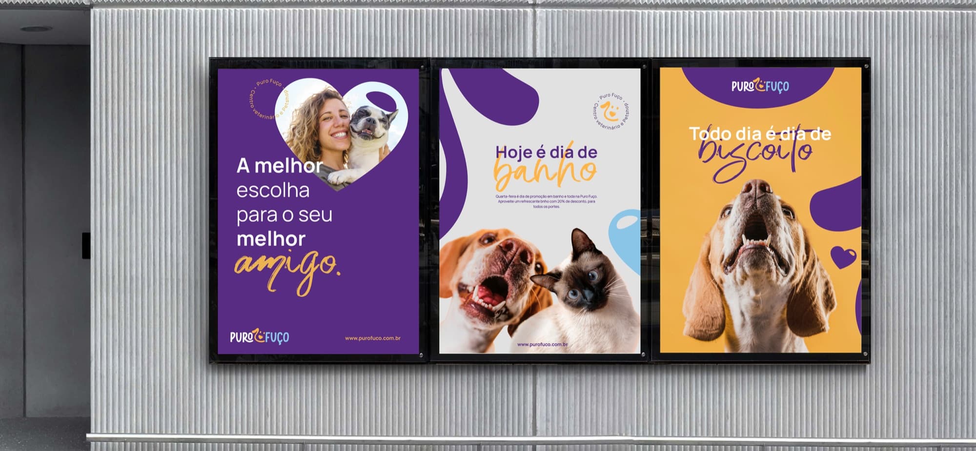
A deep purple that conveys medical trust, broken by a warm yellow and a sky blue that bring joy. The symbol merges the heart and the snout into a single shape. Typography pairs a clean sans with a handwritten script for the affectionate words (bath, treat, friend), which become the hook of every piece. Tone of voice was defined before the visuals and guides every campaign.
Result. A brand people photograph at the bus stop. The launch posters became a series, and owners recognize Puro Fuço by the way it talks, not just by the logo.